Box and Whisker charts plot groups of data through their quartiles. The values of the upper and lower quartiles are displayed in the box, while the whiskers represent variability outside these quartiles.
Building a Box and Whisker Chart
The Box and Whisker chart requires Measures representing the Upper Quartile, Lower Quartile, High, and Low values for some distribution. You create the measures that represent these values using the Statistics > Quartile Statistics option on the Query ribbon.
Step 1
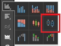
Create your Box and Whisker chart by right-clicking the Column Chart in the Discovery toolbox and selecting Box and Whisker from the options available.
Step 2
Next, to create your values, select the Measure you are interested in and, from the Query ribbon, click Statistics > Quartile Statistics > <Measure Name>.
This automatically generates the required quartile values and populates the chart.
Step 3
Add any relevant Dimensions to the Categories drop zone.
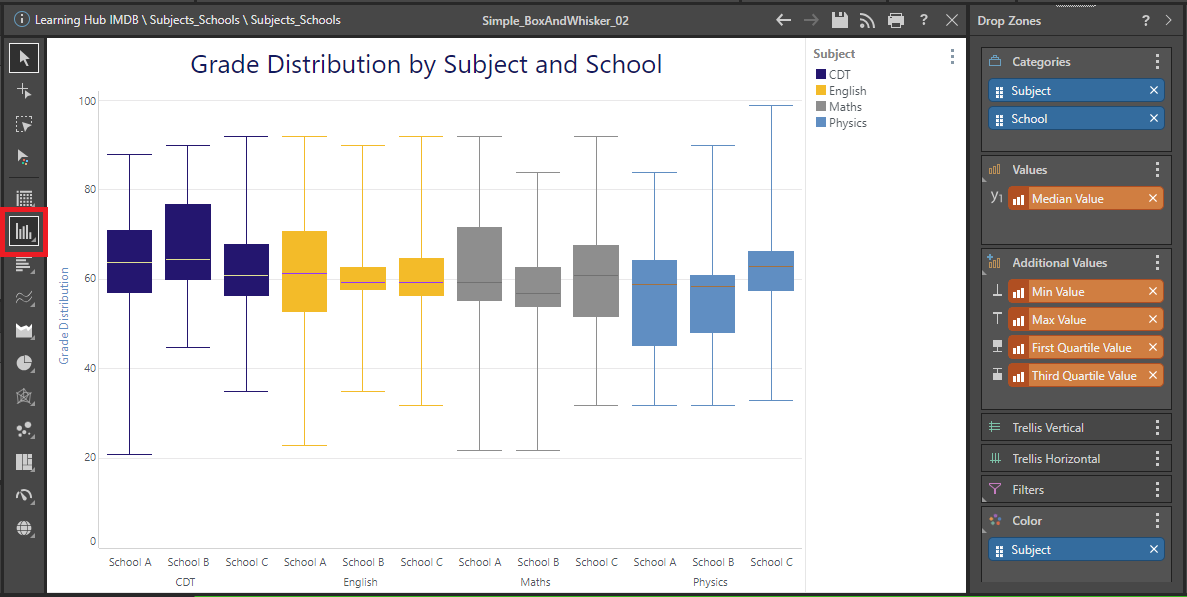
Tip: We have improved the readability and appearance of our example by adding the Subject Dimension to the Color drop zone, selecting a custom Theme from the Design ribbon, and by using the Formatting Panel to add and format the Report Title and customize the Y-Axis settings.